
Busting the Two Biggest Myths in Real Estate That Nearly Everyone Believes

As a rental property investor, I’ve always focused on cash flow first. The biggest reason for this is that I use the cash flow to enable my lifestyle (in other words, I buy stuff with it); in fact, cash flow is what allowed me to leave my corporate job six years ago and build a different kind of life.
But isn’t appreciation just as important to total ROI in real estate? Certainly it is — I actually wrote an in-depth article on cash flow vs. appreciation, where I used the multi-year model in the RIA Property Analyzer to run various scenarios to see whether cash flow or appreciation would make me more money in the long run. The upshot is that I expect to make significant returns from BOTH.
But can I determine which homes, neighborhoods, or markets will appreciate faster than others? Surely it would be nice if I could, but I don’t believe this is possible — In fact, I argued in that previous article (and countless other times) that the future of home prices is a black box, and nobody should waste their time trying to pick the winners.
Despite this, most investors still believe they CAN pick the winners. Which brings me to the two most commonly-held myths in real estate investing, both of which are mental models employed by investors to help them pick those high-appreciation properties. I have heard these myths expressed countless times from various writers, podcasters, and content creators, but also from the hundreds of potential coaching clients I’ve spoken to over the years.
So…here they are:
MYTH #1:
“Better homes/markets have greater appreciation potential than worse homes/markets.”
MYTH #2:
“Homes/markets that have experienced strong price growth in the recent past are more likely to do so in the future.”
As it turns out, both of these beliefs are completely wrong. They’re nonsense. Baloney. Rubbish. Malarkey. (Gibberish, balderdash, guff…) Whatever word you prefer, these things are JUST. NOT. TRUE.
How can I be so sure? Because I downloaded 25 years of home price data for 900+ markets and 26,000+ zip codes, analyzed them, and taught myself to use Datawrapper so I could present the findings to you in striking visualizations. (Fancy!)
If you’ve ever found yourself justifying your investment decisions with one or both of these myths, you’re far from alone. But I can assure you: your intuitions are leading you astray.
Let me prove it to you.
Real Estate Myth #1:
“Better homes/markets have greater appreciation potential than worse homes/markets.”
This belief is truly ubiquitous. The basic outline of the argument goes like this: “I’m looking at two potential rental properties, one of which is more expensive than the other and shows worse cash-on-cash returns in my pro forma. But the more expensive property is also nicer, and in a better neighborhood, so it has more appreciation potential. Therefore, I think it’s the better overall investment choice.” (You can build a similar version of this argument at a market level that would justify investing in a market with higher average home prices vs. one with lower prices.)
That doesn’t sounds like a crazy argument, does it? But actually, the data tells a very different story.
First, let’s define terms: when we talk about “appreciation potential”, we’re strictly talking about percent appreciation (not nominal dollars of appreciation.) If both homes in this example appreciate at the same rate, the more expensive home will of course appreciate by more total dollars — but this is irrelevant, because that home also requires a proportionally larger down payment, a larger more expensive mortgage, and so on.
To examine this myth, we want to compare home prices at a given point in time (by market and by zip code) to the appreciation experienced over a period of years following that point in time.
Myth #1: Market-Level Analysis
For example, here are the average home prices in July 2024 across ~900 markets, mapped against the appreciation each market experienced over the following year (you can hover over all these graphs to see the data for individual markets or zip codes):
In this case, we see essentially no correlation at all between home prices and appreciation. Among lower-priced markets (left side of the graph), about equal numbers saw rising prices as saw falling prices; the same is true for mid-priced markets and high-priced markets.
The statistical trend line is drawn over this data. If better markets appreciated faster than slower markets, that line would slope up and to the right. In this case, it actually slopes very slightly down, indicating a small negative correlation (i.e. lower-priced markets were slightly more likely to appreciate strongly than higher-priced ones.)
But that’s just one example, right? Let’s take a look at the same data for the previous year:
Once again here, we see almost no correlation at all: markets all along the price showed equal likelihood of outperforming or underperforming the national average.
”Hold on, Eric! This is only showing appreciation for a single year, which can be volatile. And most investors have a much longer horizon than than. What does the data look like over various 5-year periods?”
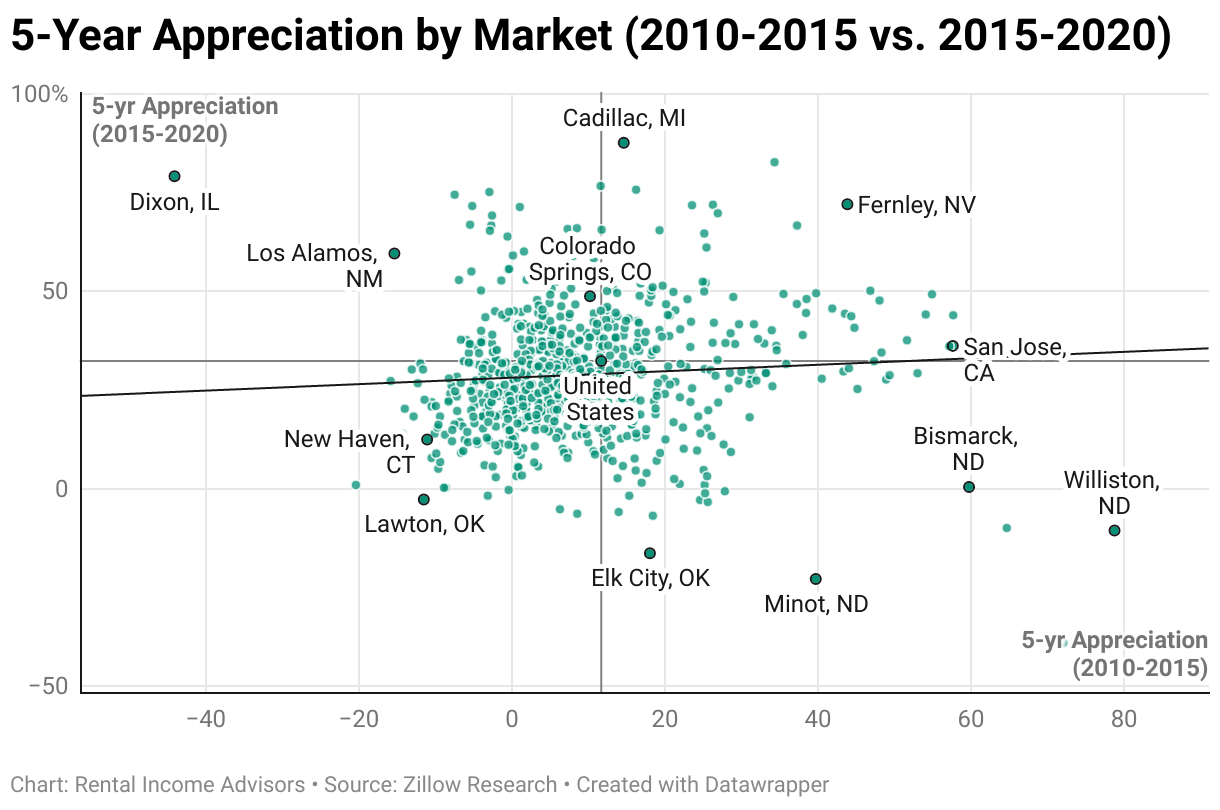
Thought you’d never ask! Here’s one comparing prices in July 2020 by market to the amount of appreciation experienced in each market over the next five years:
Hmm…pretty much the same story. Over these five years, there was a SLIGHT positive correlation, but it’s extremely small — certainly not something you would base your investing on. The correlation is just too weak, and there are plenty of counter-examples: high-priced markets like Boulder, CO and Austin, TX underperformed the national average, while lower-priced markets like Springfield, OH and Fayetteville, NC were high flyers.
But what about a different 5-year period? Let’s look at the one that started in 2017…and also the ones that started in 2012 and 2007:
The first two graphs might have tricked you into thinking a pattern was emerging: both those 5-year period showed somewhat stronger (but still very weak) positive correlations. But the preceding 5-year period showed exactly the opposite — a weak negative correlation.
But the slope of the line is less important than the strength of the correlation, which in all cases is extremely weak. Look at those green dots — they’re EVERYWHERE. The price point of a given market is simply not reliably predictive of future home prices.
And yes, that’s also true over 10-year periods…
…and 20-year periods:
So what does this mean for you as an investor? It means you should NOT favor a given market because it has higher-priced homes, thinking that means a greater likelihood of strong appreciation. Because it doesn’t — there is simply no meaningful correlation at all.
What about within a given market, though? Do nice neighborhoods fare better with appreciation than less-nice ones?
Myth #1: Zip Code Analysis
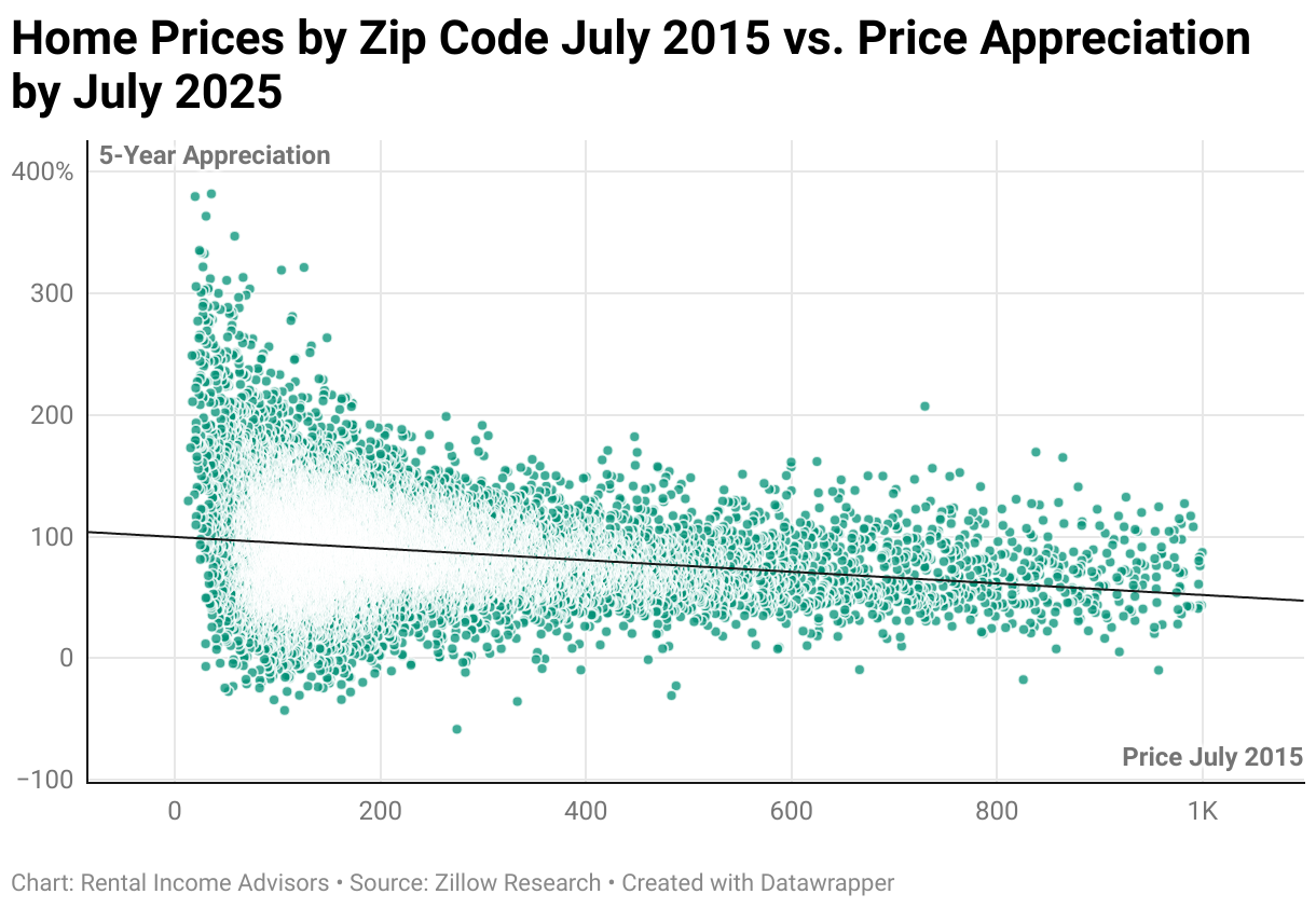
To answer that, we’ll need to look at the same data by zip code. Here are the average prices from July 2024 in over 26,000 zip codes, mapped against the percent appreciation they experienced in the following year:
(Note: I removed zip codes with average prices above $1.2M to make the graph more readable…otherwise, it would reach out to $6M+ and squish all of this detail to the left. Removing this small number of data points does not change our conclusions at all.)
Here again, we see a completely even distribution of “rising zip codes” (above the trend line) as “falling zip codes” (below the trend line) across the full range of price points. Over that year, nicer homes did NOT appreciate more than less-nice ones; rather, all homes had an equal chance of outperforming or underperforming the average.
Over the last 5 years, the data looks very much the same, with a completely flat trend line:
At the risk of beating a dead horse: if someone started investing in 2020 within a given market, and said to themselves, “I’d rather buy the $250K house instead of the $125K house because it has more appreciation potential,” that person was completely, utterly mistaken. The $250K home has just as much chance of appreciating LESS than the $125K home as it has of appreciating MORE.
We can zoom into a given market to see this even more starkly. In those 5 years in my investment market of Memphis, there was actually a strong negative correlation between prices and appreciation — in other words, the lowest-priced zip codes appreciated the most, while the highest-priced zip codes appreciated the least (glad my homes were in those lower-priced areas!):
We can go back 10 years by zip code, and still see very little correlation — in fact, from 2015 to 2025, lower-priced zip codes were a bit MORE likely to see strong appreciation than higher-priced zip codes:
With that, I will consider Myth #1 BUSTED, and I hope you will too. Let’s move on to Myth #2…
Real Estate Myth #2:
“Homes/markets that have experienced strong price growth in the recent past are more likely to do so in the future.”
This belief is also extremely widely-held. We know that markets rise and fall, but when we see a market that has strong growth over the past 2-5 years, we typically assume that growth will continue into the future. After all, why wouldn’t it?
Well…cuz it just doesn’t work that way, as it turns out.
To examine this myth, we need to map trailing period appreciation against leading period appreciation. In other words, does the appreciation over the last x number of years predict appreciation in the coming y number of years?
Myth #2: Market-Level Analysis
Let’s start by looking at a few 1-year periods:
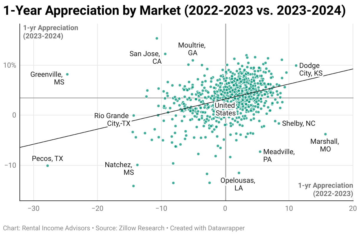
In these graphs, you’ll see quadrants. The national average for the trailing and leading periods defines the borders of the quadrants in each graph — so strong performance is measured relative to the US average, not to 0%.
In both the cases above, we actually DO see some correlation, such that markets with strong growth in the preceding year are more likely to experience it in the following year. Visually, we can see this in the trend line, and also by noticing that there are more dots in the upper-right and lower-left quadrants than the other two.
But this kinda makes sense, when you think about it. There is such a thing as pricing momentum in a market over a period as short as a couple of years; the factors that caused a market to rise or fall in the preceding year will likely still be at play in the following year. (Though certainly not always — there are still plenty of markets in the upper-left and lower-right quadrants, each of which had a reversal of fortunes just in the 2-year period being mapped.)
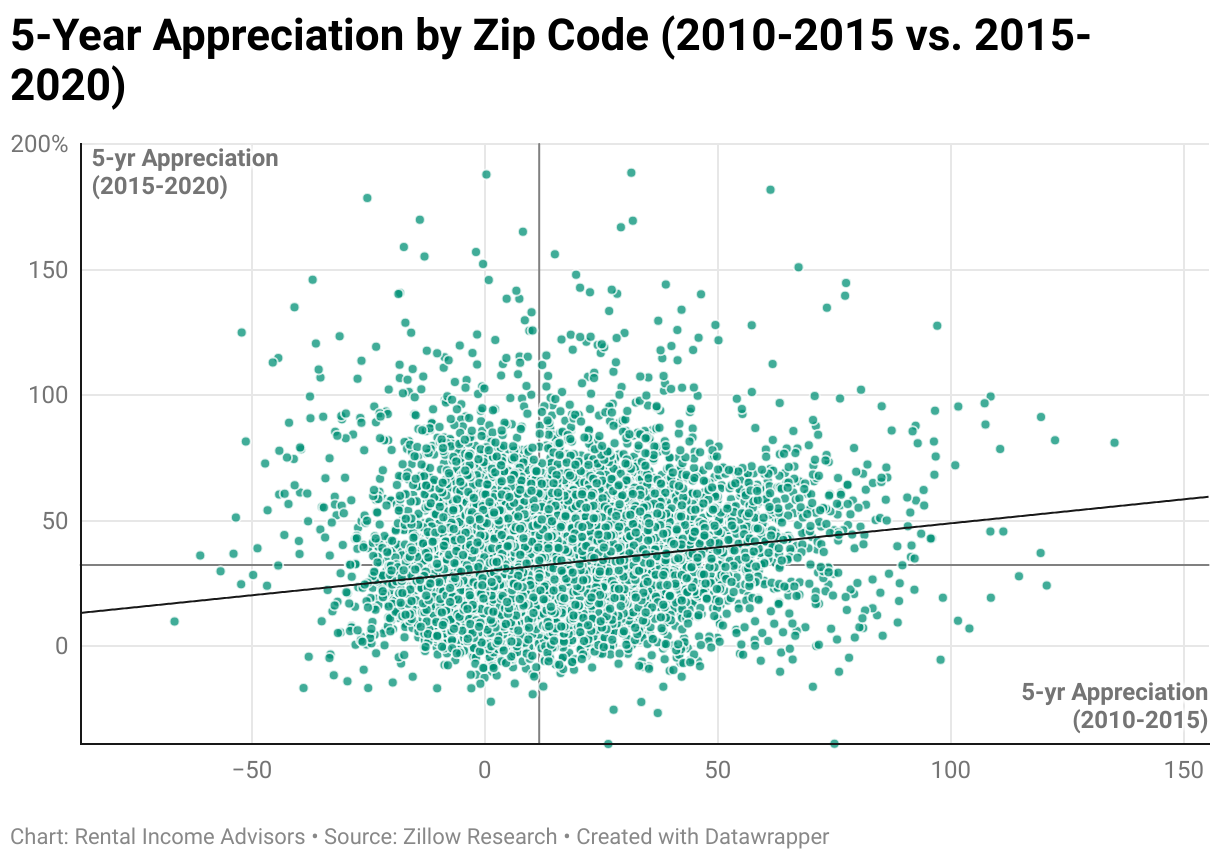
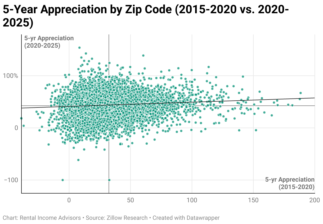
What about longer periods? Do the last five years predict the next five years?
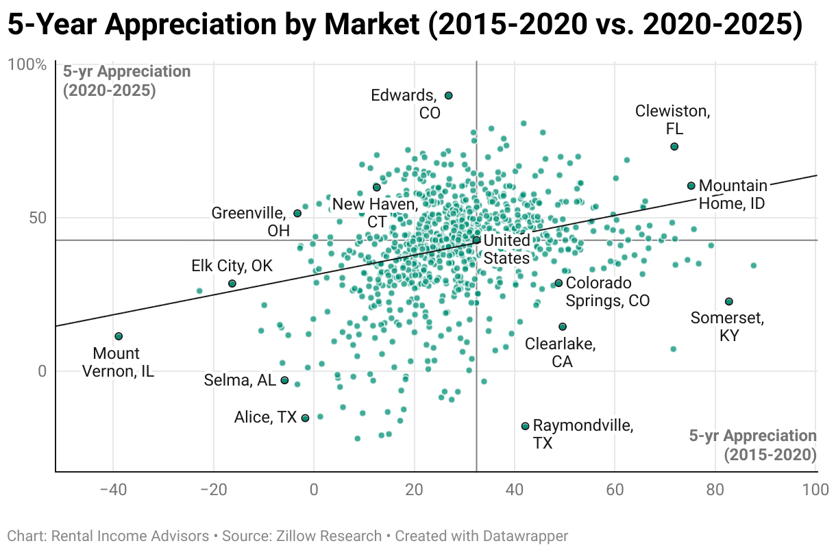
We see the correlation weakening here, with dots spread wider over our graphs. The 2010-2015 period was not predictive at all of the next 5 years. And even though there was some positive correlation between 2015—2020 and 2020-2025, it’s very weak — without the benefit of the trend line, you’d be hard-pressed to see any correlation at all.
This just isn’t reliable enough to base investing decision on. For example, if a hypothetical investor was shopping markets in 2020 and using the preceding 5 years of price history as a guide, Colorado Springs, CO would have a great target (+49% in the last 5 years vs. 32% for the country), whereas New Haven, CT would have been nowhere on their list (just +12% in the last 5 years.) Both those markets are highlighted on the graph, btw.
Had this investor chosen Colorado Springs instead of New Haven, they would have been in for quite a shock in the next five years:
Colorado Springs appreciated 29% in 2020-2025, well below the national average of 43%
Meanwhile, New Haven appreciated a whopping 60%
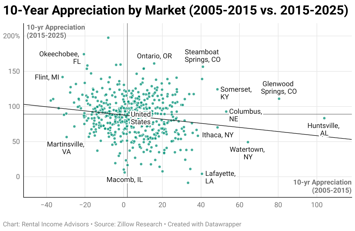
Maybe a longer trailing period is needed to establish true trends. If we look at 10 years of appreciation, will that help us predict the next 10 years? You won’t be surprised at this point to learn that it’s not predictive at all — this particular example actually has a weak negative correlation:
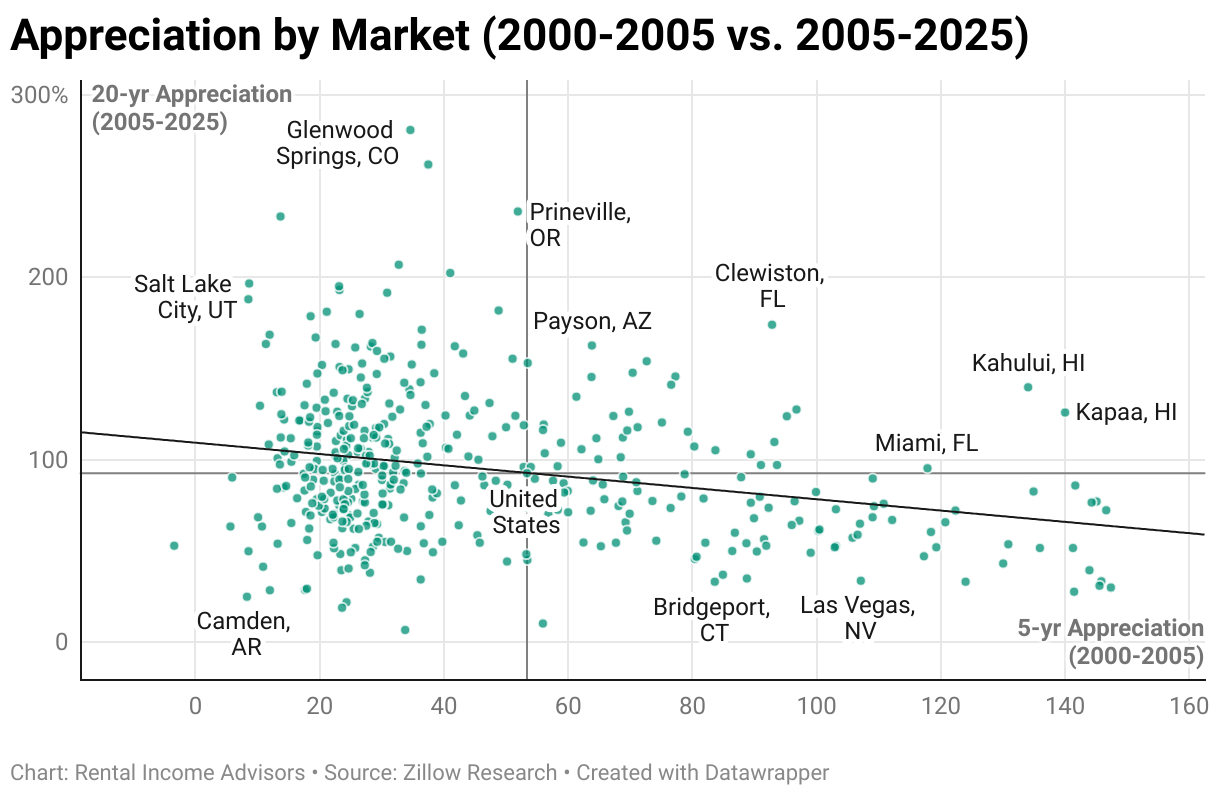
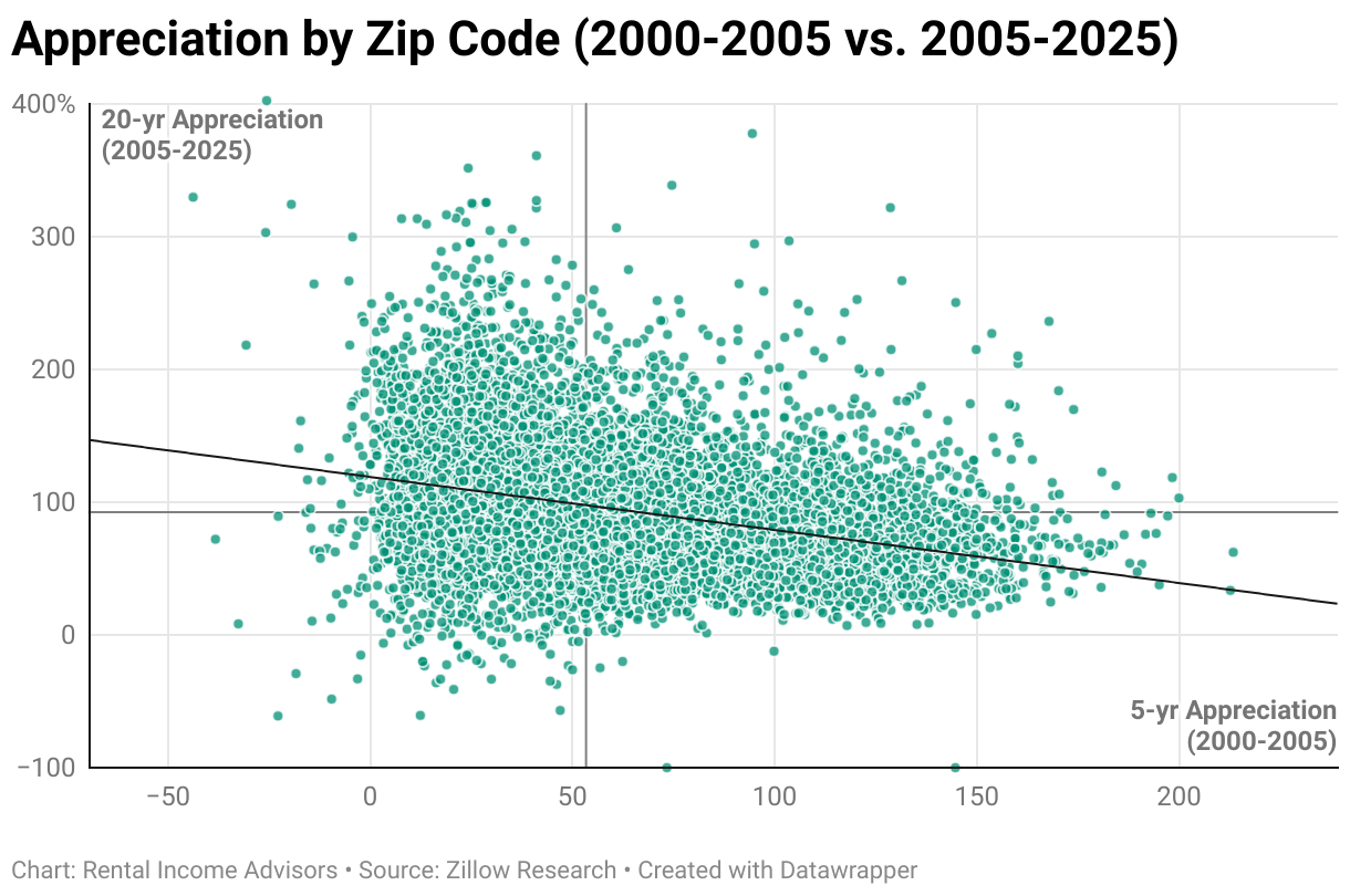
Let’s do one more example at the market level. Zillow’s data only reaches back to 2000, so that will be the limit of what we can examine — but if we could go back to 2005 and use the preceding 5 years of of home price data to inform our choice of investment market, where would we be today, 20 years later? Would it have helped us?
Not at all — in fact, there was some negative correlation here. In other words, you’d have been better off looking at the list of worst-performing markets in 2000-2005 to decide where appreciation would be highest in the next 20 years:
Myth #2: Zip Code Analysis
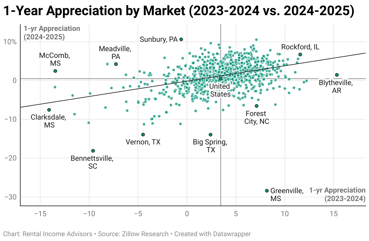
Finally, just as we did for Myth #1, let’s look at these same correlations at the zip code level. Does recent price performance within a zip code predict future price performance in that zip code?
Let’s start again with the 1-year periods, to see if pricing momentum in a given year predicts price movement in the coming year:
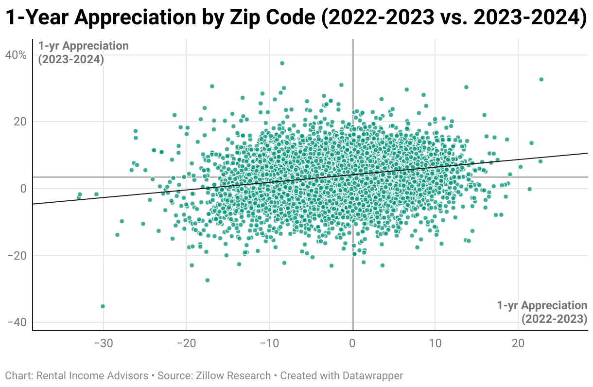
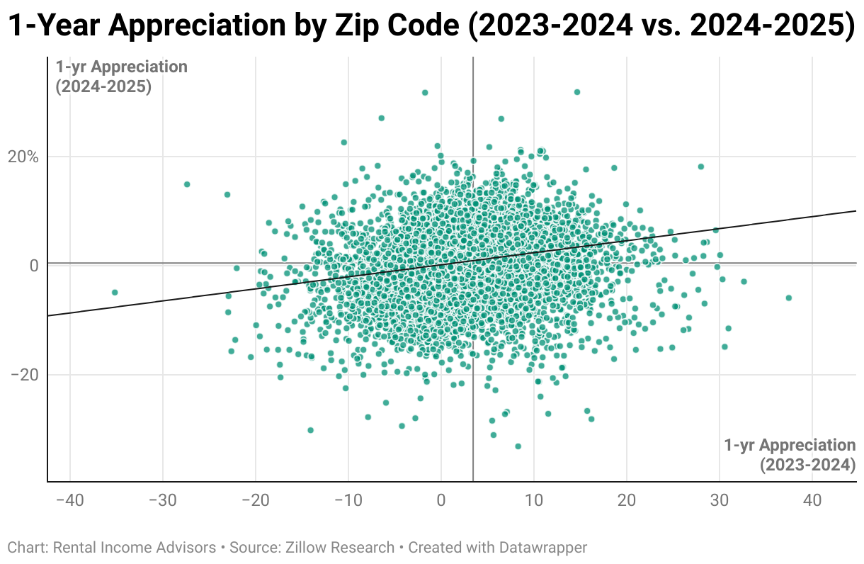
Just like we saw at the market level, there is a (VERY) weak positive correlation here. But it’s actually even weaker than the market level data. In truth, this is hardly a correlation at all — eliminate the trend line, and these would look like nearly perfectly symmetrical blobs, without any clear bias toward the top right or lower left quadrants. Said a different way: zip codes with strong price movement in the past year and those with weak price movement in the past year are (nearly) equally likely to perform well in the coming year. This is a pretty remarkable fact, when you sit with it, and undermines the vast majority of real estate investing advice & guidance that’s out there.
Let’s see if the patterns are any clearer using 5-year trailing and leading periods:
Nope, just more of the same. What about 10-year periods, or the 2000-2005 trailing period vs. the 2005-2025 leading period?
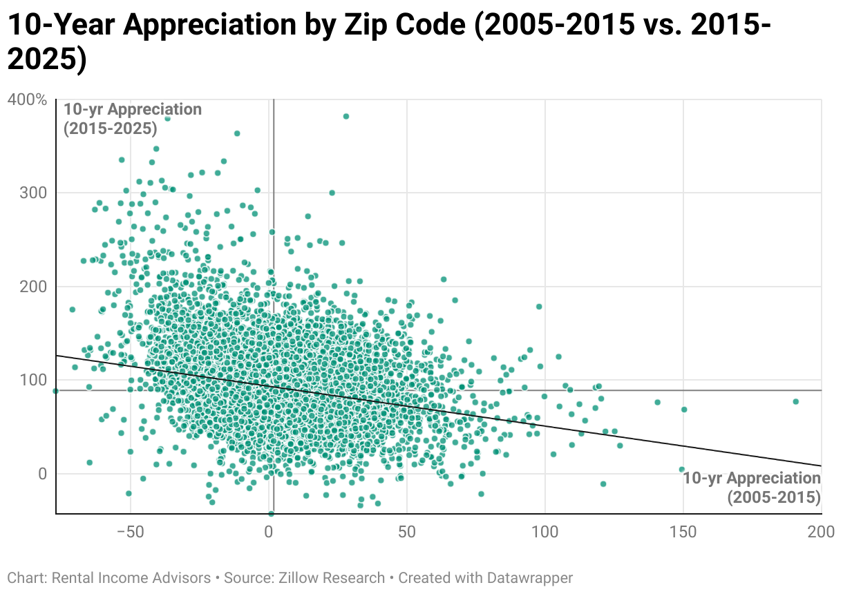
Same story here as we saw at the market level with these two particular comparisons — a weak but still noticeable NEGATIVE correlation, such that the zip codes that performed best in the forward investing period were more likely to have underperformed in the trailing period.
Conclusion
To summarize our findings, 25 years of pricing data at the market and zip code level prove that:
Better, more expensive homes & markets do NOT appreciate more rapidly than worse, less expensive homes & markets, and
Recent appreciation is NOT predictive of future appreciation
So where does that leave us as investors? How should we think about rental property investing, given these realities?
If future home prices are unknowable, we’re left to assume that all properties have equivalent appreciation potential. We’re forced to give up the false belief that we can accurately predict future home prices or pick the winners that will appreciate the fastest.
In other words, we become cash flow investors, those who focus on lower-cost markets & properties whose cash flow potential is greater, while still knowing that long-term appreciation (i.e at the rate of inflation) is likely to build significant wealth as well — particularly if we use mortgages to expand our buying power.
But what about…
I imagine a few people might still be thinking, “Yeah, but what about [insert your personal theory about how to predict future home prices here]?”
It’s comforting (both in life and investing) to think there’s a way to see the future. If only we could pick the winners, the game would be so easy! But without a time machine that would let us Marty McFly the situation, it’s likely impossible. Case in point: stock investors have been trying to crack this code for a century, without any success — it’s now been proven beyond any doubt that nobody can consistently beat the overall market year after year. In other words, picking winners & losers is speculative and random. Nobody can see the future.
The same is true with home prices. You can create any system or formula you want, but you ultimately have to answer this question: is your approach actually predictive? You’d have to do an analysis like the one above to see whether it is or isn’t. So far, it’s obvious that the two most common and intuitive beliefs about future home prices are COMPLETELY WRONG. Your system seeming sensible/reasonable is not the same thing as it being useful/predictive.
My advice? Face the harsh truth that you simply can’t predict the future of home prices. Accepting this reality is an important first step in becoming a smart and successful long-term investor in rental properties.
About the Author
Hi, I’m Eric! I used cash-flowing rental properties to leave my corporate career at age 39. I started Rental Income Advisors in 2020 to help other people achieve their own goals through real estate investing.
My blog focuses on learning & education for new investors, and I make numerous tools & resources available for free, including my industry-leading Rental Property Analyzer.
I also now serve as a coach to dozens of private clients starting their own journeys investing in rental properties, and have helped my clients buy millions of dollars (and counting) in real estate. To chat with me about coaching, schedule a free initial consultation.